O’Brien National Service Centre Systems
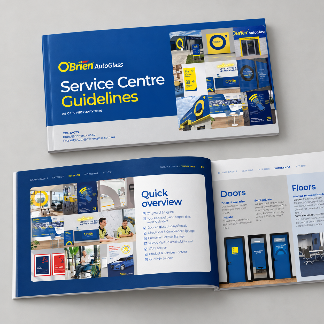
I led the creative direction and developed the design system for O’Brien AutoGlass Service Centres and Distribution Centres as part of the wider brand refresh. Bringing signage, way-finding, fit-outs, materials and supplier guidelines together, I created a cohesive approach that could adapt across a diverse national network.
Scroll to view design work
Marketing
Creative Direction
Concept Development
Signwriting
Fit-out & Interior Design
Guidelines, DAMs & templates
Brand Identity
Safety Compliance
Production Artwork
ExteriorsI developed an exterior system that made each centre unmistakably O’Brien and easier to navigate. Bold colour blocking, a larger O’ symbol and clearer signage give the brand more presence from the street, while a highlighted customer entrance helps people find their way. The system adapts across different buildings, bringing the national network together without treating every site as identical.
-
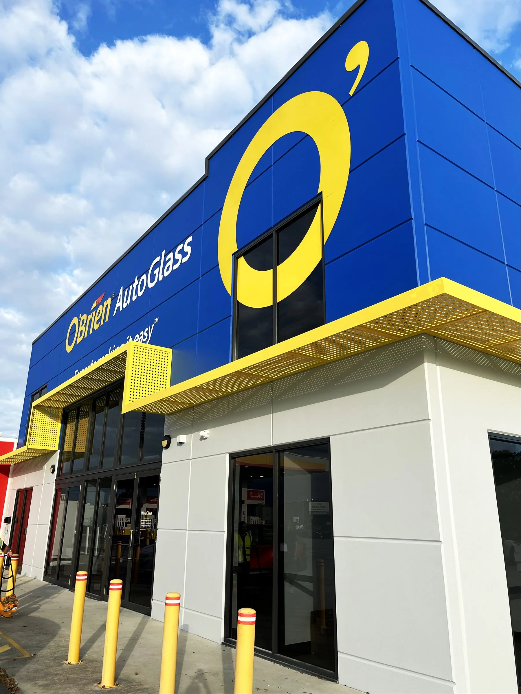
I gave the O’ symbol a much bigger role, turning it into a bold architectural feature across façades, glazing and corners. Its scale and yellow colour create a recognisable landmark, helping each centre stand out before the logo is even read.
-
I simplified the visual hierarchy so the O’Brien logo and O’ symbol lead, with supporting messages given room to breathe. Logo scale and placement respond to each building and its street views, making the brand easier to identify from a distance.
-
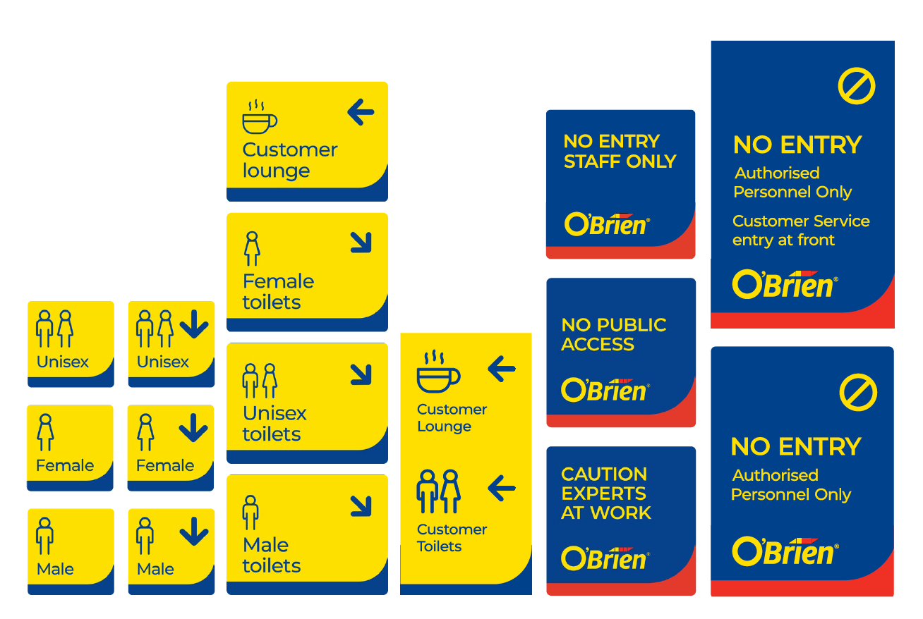
I created a consistent family of signs to guide customers from arrival to reception. Blue and yellow support everyday navigation, while red highlights restricted areas and safety messages. Clear priorities keep practical information easy to find without competing with the main branding.
-
I brought the service offering closer to the entrance, using the glazing to explain what the centre can help with before customers step inside. Simple messaging and the O’ cut-out turn a practical information panel into part of the branded arrival experience.
-
I balanced O’Brien blue with a grey base and deliberate yellow highlights to create a cleaner, more considered exterior. The colour blocking gives the building structure, strengthens the main brand elements and draws attention to customer entry points.
-
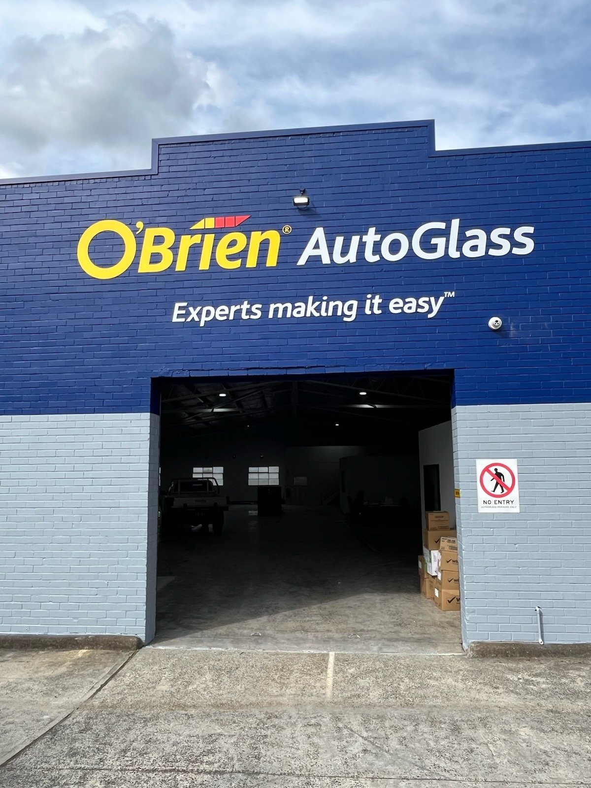
![]()
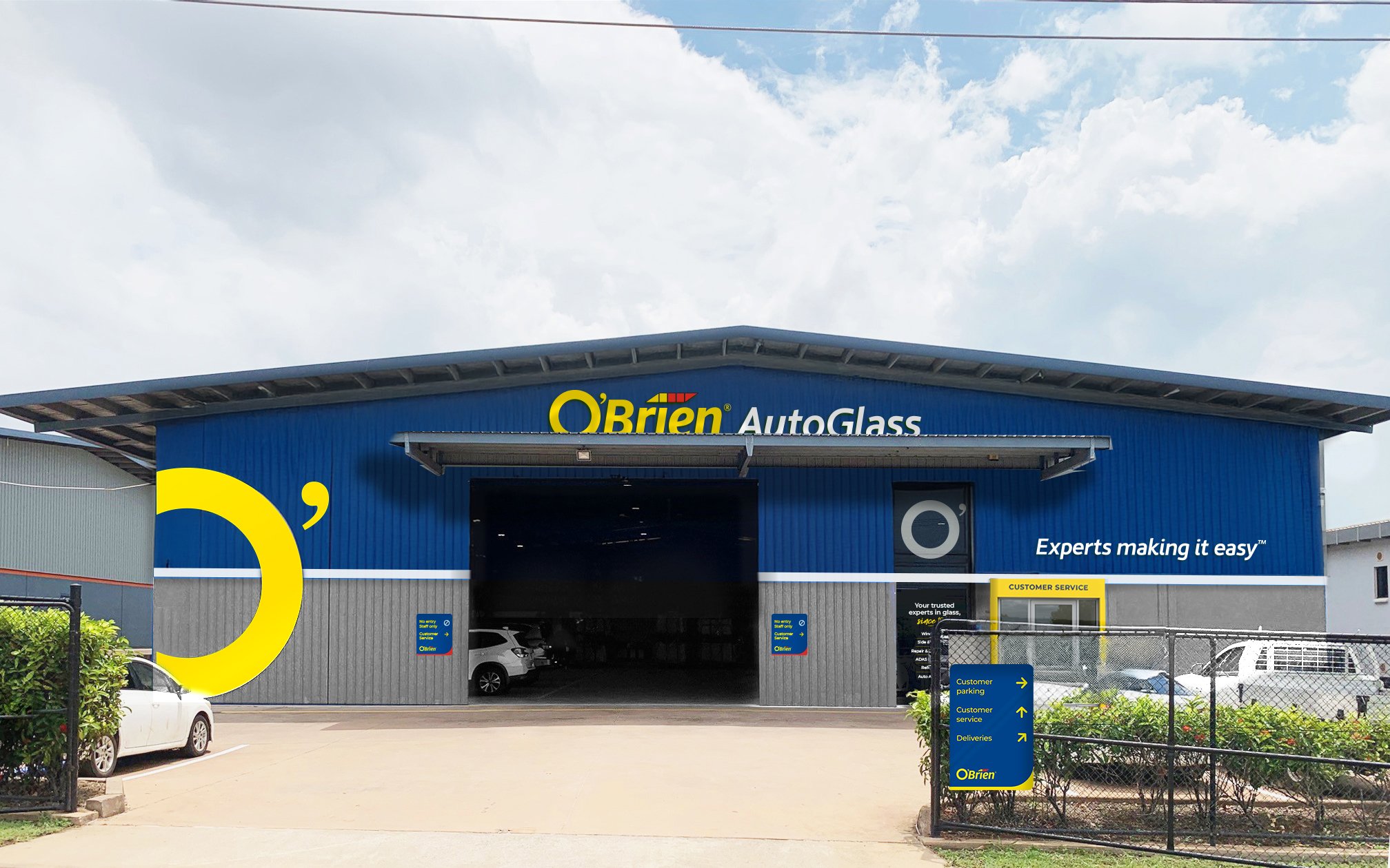
Darwin NT Exterior
The Darwin centre brings the exterior system together: bold colour blocking, prominent branding and a clearly marked customer entrance.
-
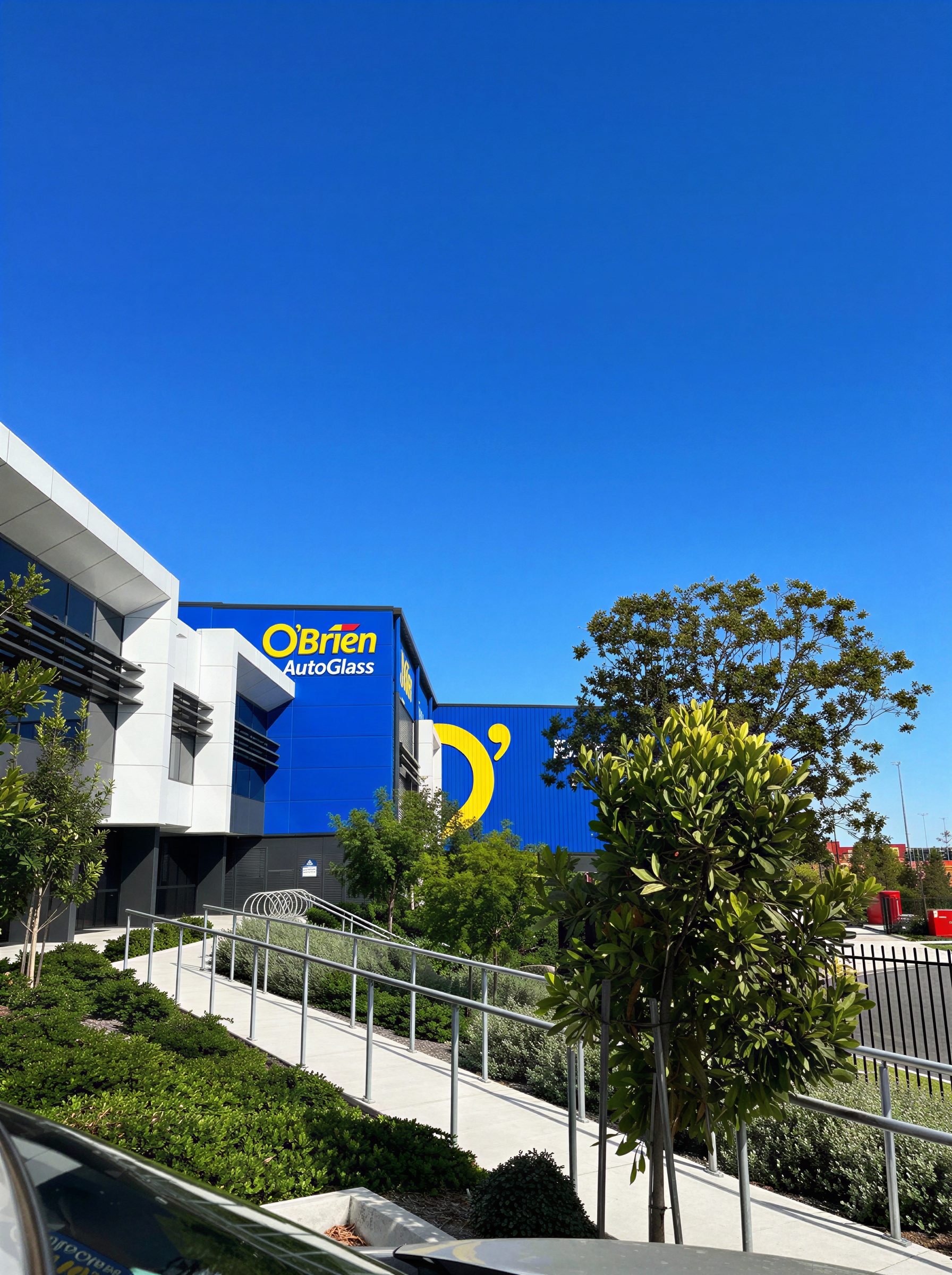
![Big Yellow O']()
Big Yellow O'
At Brendale, the oversized yellow O’ is displayed on each side of this big and boldly branded Service Centre that if you can imagine, was once a large orange kennards. It created a landmark that could be seen from the highway in more than one direction.
-
![]()
Burwood VIC Exterior
The Burwood centre shows how the refreshed identity adapts to a different façade, using strong branding and a restrained colour palette to create a consistent street presence.
-
![]()
Wayfinding
A coordinated signage family makes directions easier to follow, guiding customers through the site while keeping the overall look clear and consistent.
-
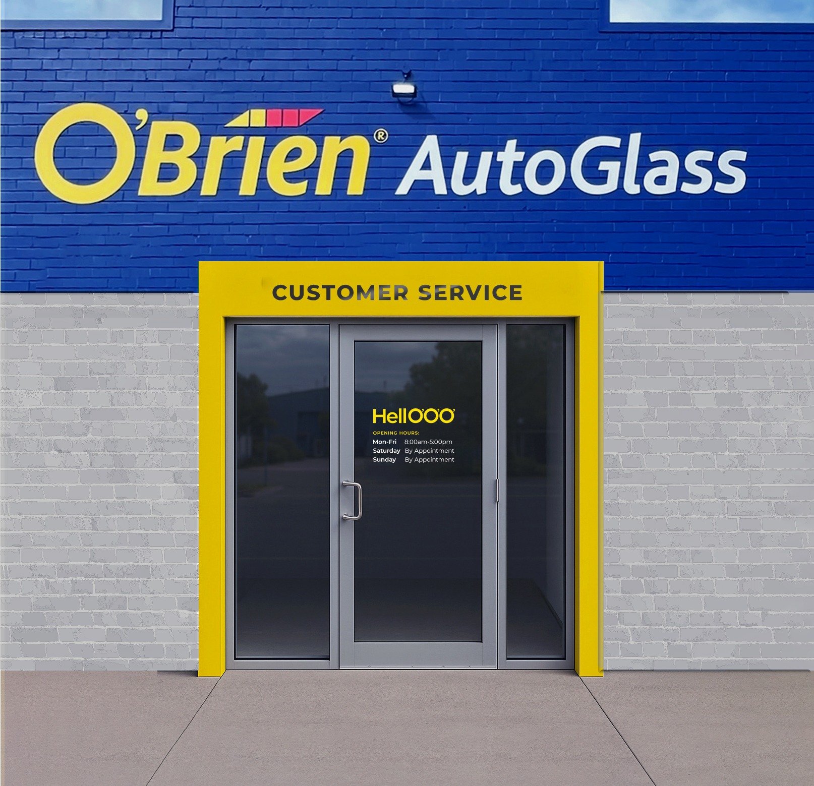
![]()
Customer Entry Point
A yellow Customer Service surround makes the entrance easy to spot, giving customers a clear destination as soon as they arrive.
-
![]()
Brisbane Distribution Centre Entrance
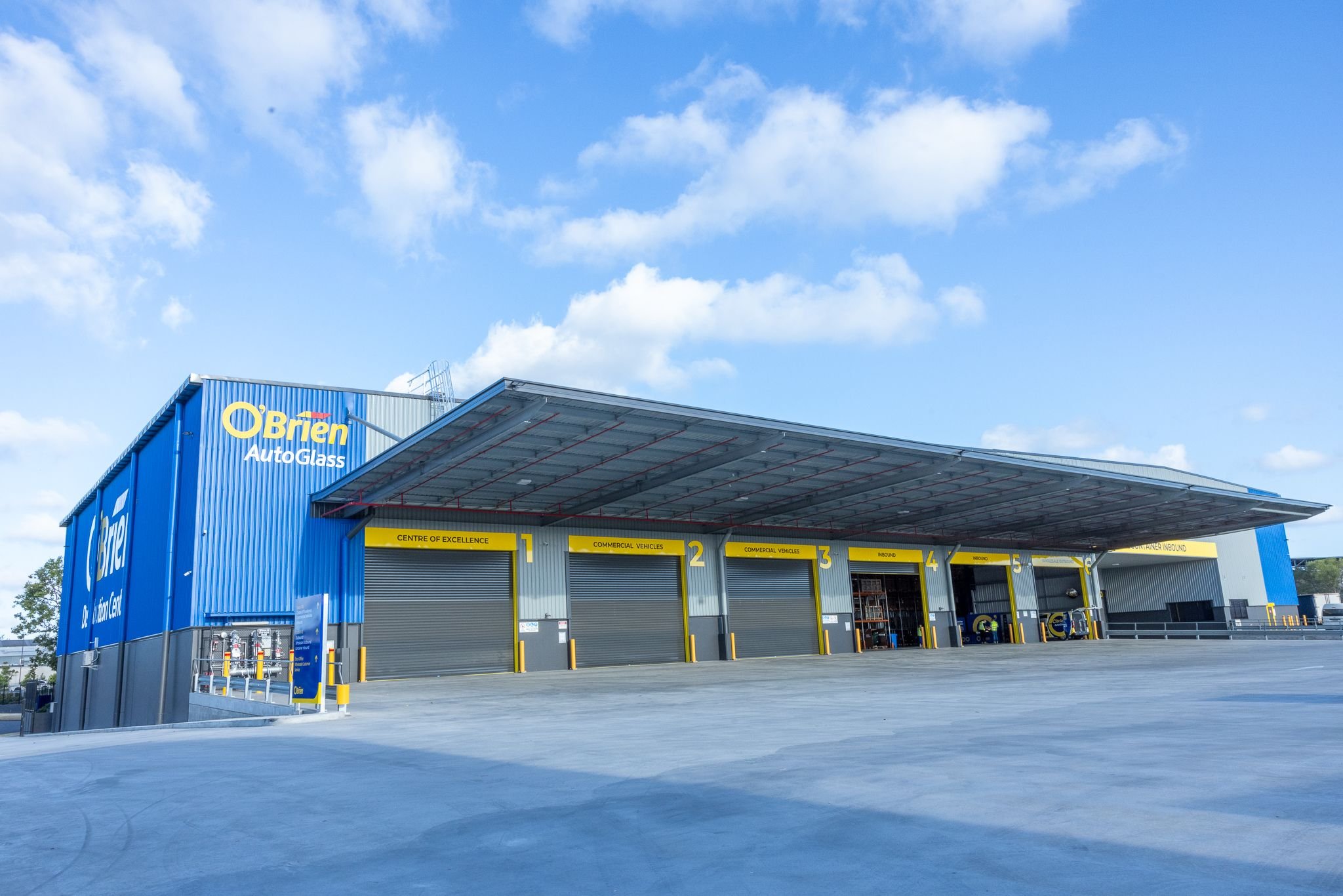
The Brisbane entrance carries the same visual language into a larger operational site, connecting the Distribution Centre with the wider O’Brien network.
-
![]()
Brisbane Distribution Centre Docks
The exterior system extends across the loading docks, bringing consistent colour and branding to a large industrial façade.
INTERIORSI brought the refreshed brand inside, developing a fit-out system that connected reception, waiting areas and workshops. From flooring, materials and paint colours to signage and wall graphics, every element had a job: make customers feel welcome, help them find their way and give each centre a consistent O’Brien feel.
-
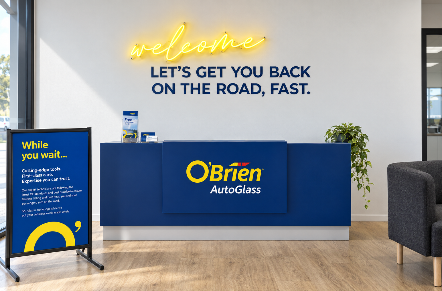
I designed reception and waiting areas to feel welcoming, clear and recognisably O’Brien. Customer service signage, branded messaging and a coordinated fit-out help customers know where to go and feel more comfortable while their vehicle is being looked after.
-
I developed a coordinated palette of flooring, materials, finishes and paint colours to bring the fit-out together. Grey and white create a clean base, with O’Brien blue and smaller yellow accents adding recognition without overwhelming the space. The guidelines give suppliers a consistent direction across different centre layouts.
-
A consistent signage system connects customer areas with the working parts of each centre. Clear labels, directional signs and safety messaging help people navigate the space, distinguish customer access from restricted areas and keep essential information easy to spot.
-
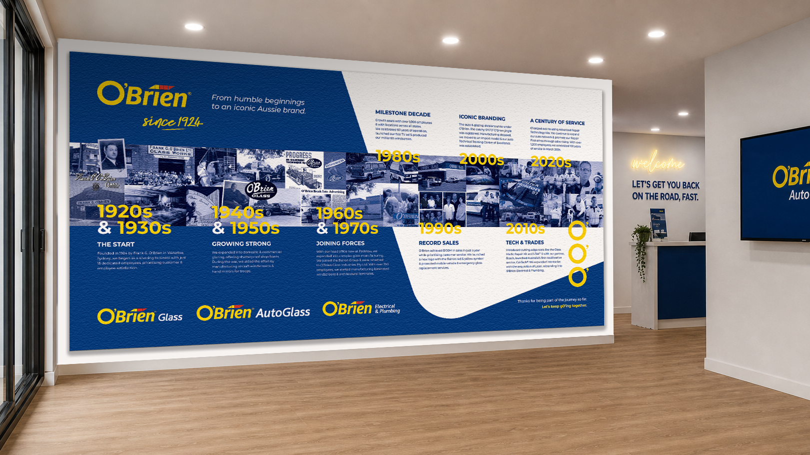
I used wall graphics to give the interiors personality and purpose. The history wall brings O’Brien’s heritage into the customer experience, while welcome messaging and product displays make the space more engaging and help explain what the team can offer.
-
I brought the interior system together in detailed fit-out guidelines covering materials, finishes, signage and artwork placement. An external Brand Hub gave suppliers access to the latest guidelines and production files, making it easier to deliver a consistent result without starting from scratch at every location.
-
![]()
The O'Brien History Wall
A custom history wall turns more than a century of O’Brien stories into a bold interior feature, connecting the refreshed space with the brand’s heritage.
-
![]()
Customer Service
A bold blue reception desk, warm timber-look flooring and a yellow welcome sign bring the brand together in a friendly first point of contact.
-
![]()
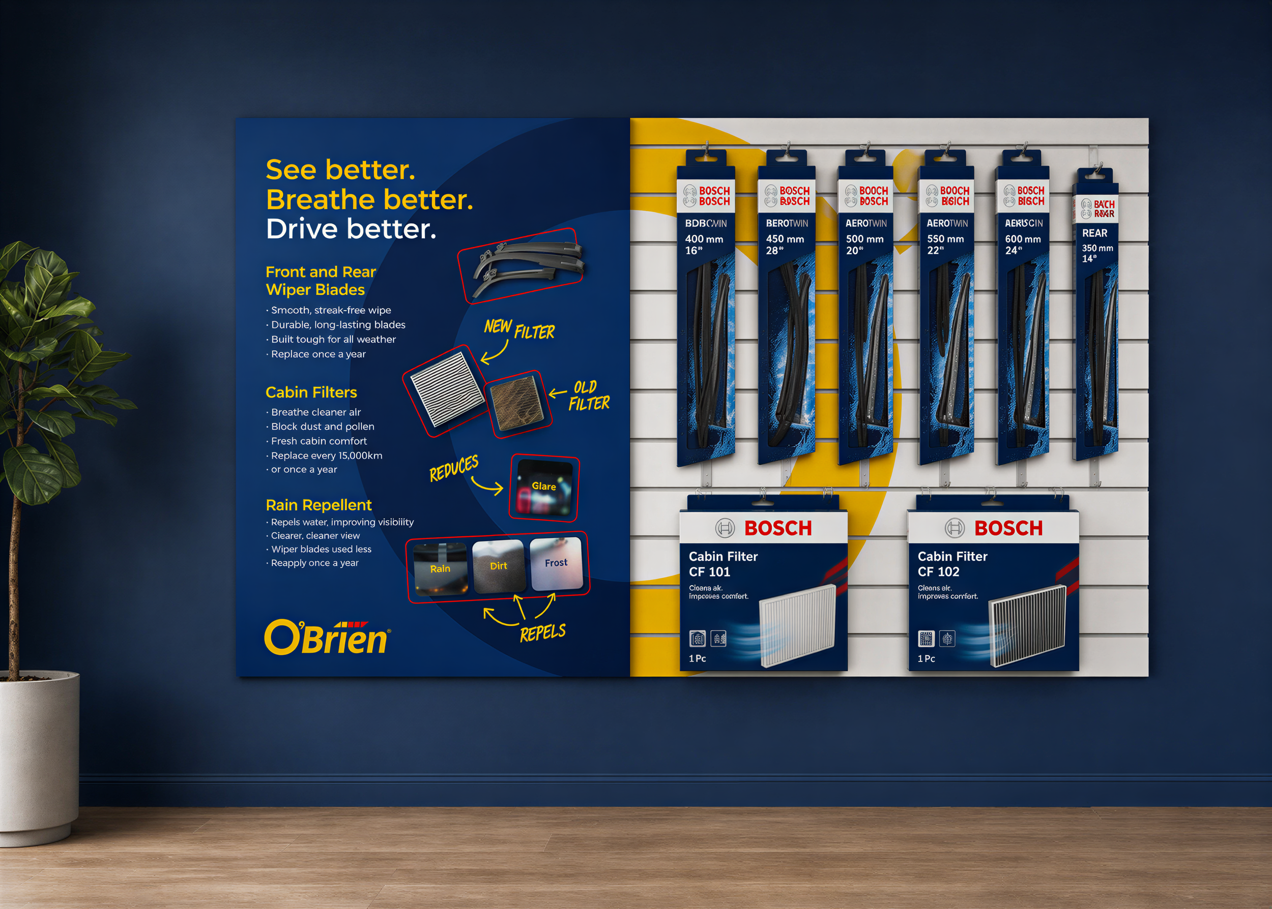
VAPs Wall
A dedicated product wall brings wiper blades and cabin filters into the customer space, pairing clear benefits with a display that feels part of the fit-out.
-
![]()
Experts Viewing Window
The O’ symbol frames a view into the workshop, inviting customers to watch the experts in action while keeping the waiting area visually connected to the service.
-
![]()
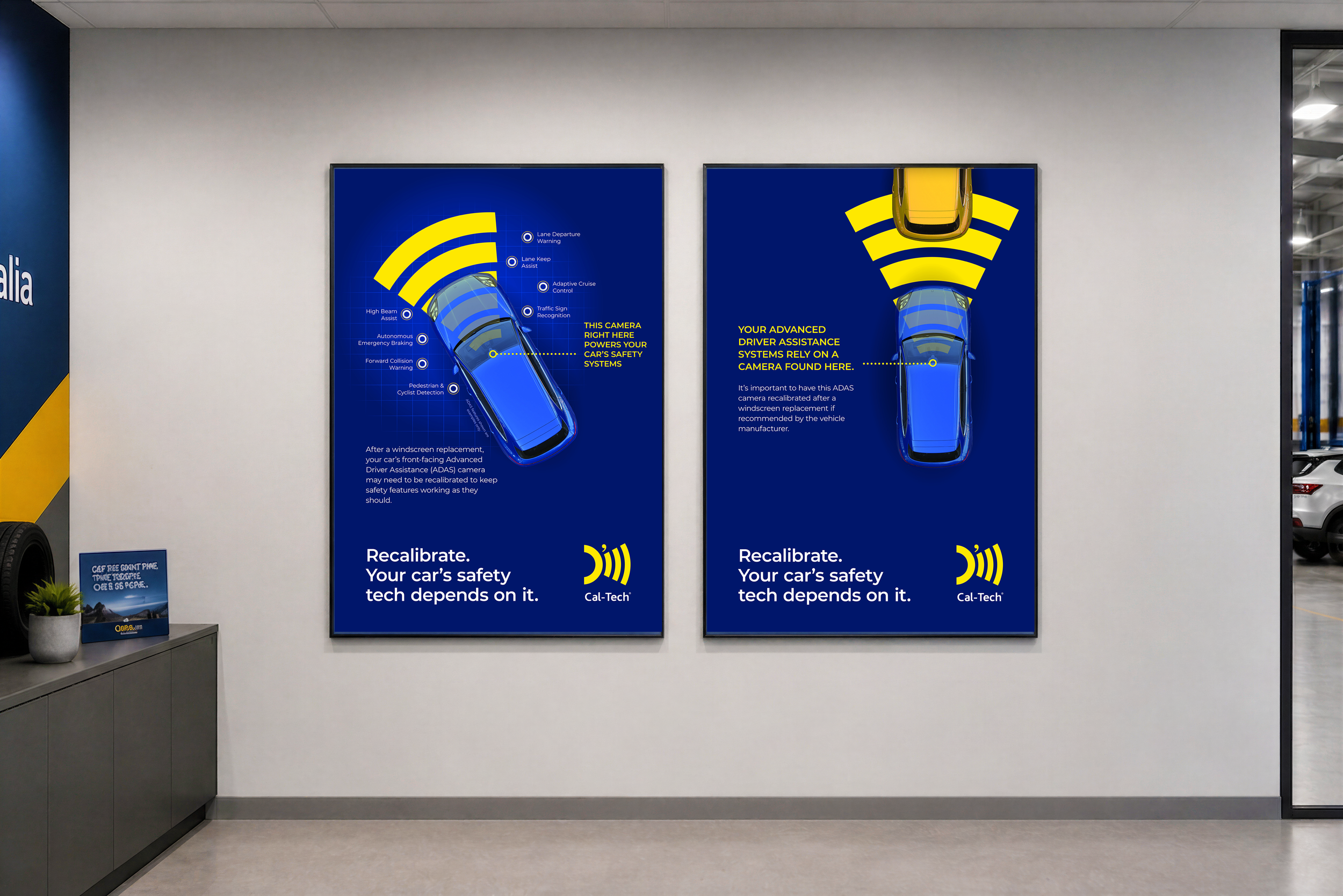
Cal-Tech Posters
Cal-Tech posters use clear diagrams and bold brand colours to explain vehicle safety technology and why recalibration matters, making technical information easier to understand while customers wait.
-
![]()
Interior Furnishing Selections
Comfortable seating, greenery and warm finishes soften the service environment, with furniture selections that support a welcoming, cohesive customer waiting area.
-
![]()
Fit-out selection
A coordinated fit-out palette carries the brand into shared spaces, combining blue flooring, yellow accents and warm timber tones so furniture and finishes work together.
-
![]()
Detailed Guidelines
The interior guidelines bring flooring, finishes, furniture and signage into one practical reference, helping suppliers translate the design into a consistent fit-out across the network.
-
![]()
Caution: Experts fast at work
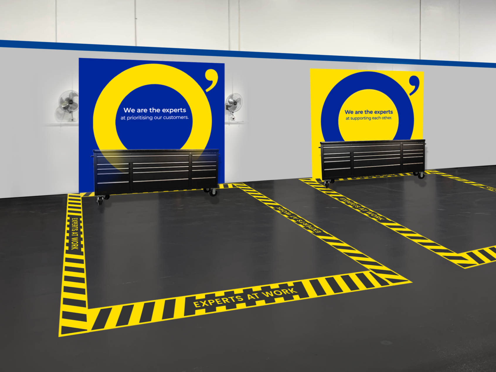
Staff common areas also got a refresh with new signage displaying the brand values in first person emphasising the importance of their people. An injection brand colours and a little quirky floor signage to add some personality