
O’Brien Website Design Refresh & Optimisations
The brief: Optimise the current digital experience to increase website traffic & conversion rates while creating a more recognisable brand experience that also helps supports the customers online journey, with key clear messages and actions easy to spot and navigate - a clearer path from ‘I need help’ to ‘book me in’.
My role: I owned the O’Brien website and online booking creative optimisations. I translated the refreshed brand into a consistent and WCAG compliant digital style, using the O’Brien updated colour palette, typography, imagery and O’ symbol across the modules. I redesigned major drop-off points in the customer online booking journey including redesigning the easily missed and confusing service finder, reworking modules with a mobile first and brand approach, and redesigning a clearer, quicker and user friend booking form/flow:
Scroll to view design work
Marketing
UX/UI
Concept Development
Signwriting
Figma & Illustrator
Responsive Design
Brand Identity
WCAG Compliance
Agency Collaboration
-
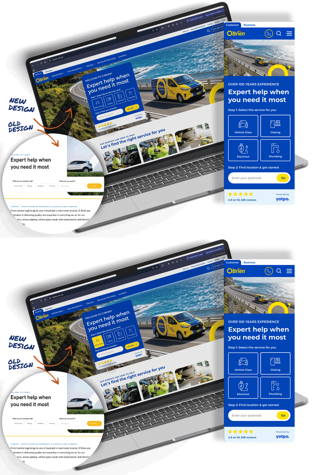
The right service, easier to find
The blue service selector stands out from the surrounding page, giving customers an obvious place to start. Distinct icons and clear labels make the options easier to compare at a glance and help people find the service they need.
-
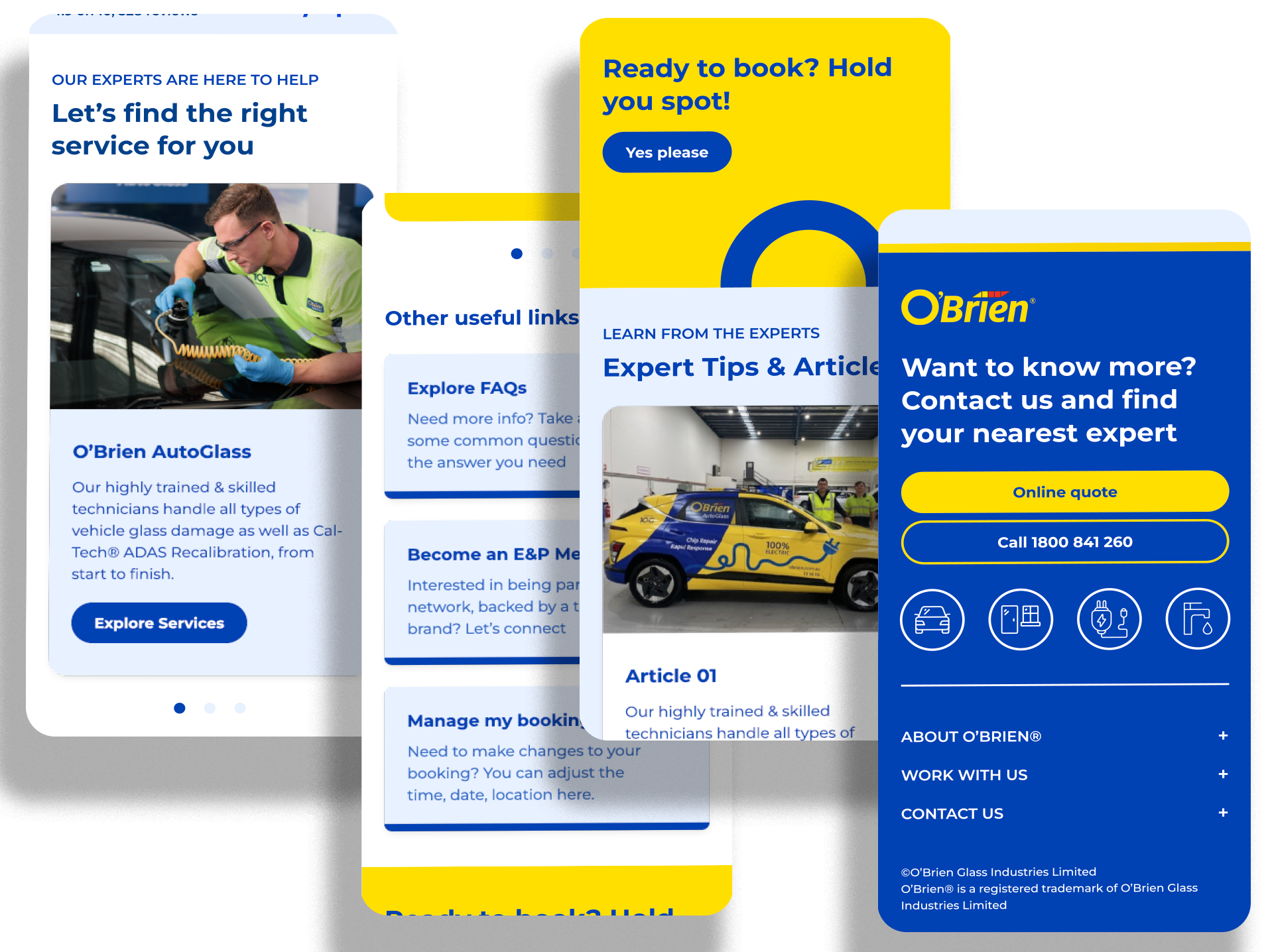
Designed for the scroll
Mobile layouts bring service choices, customer reviews and benefits into a clear scrolling sequence. Images and concise copy work together, with prominent buttons helping customers move from browsing to taking action.
-
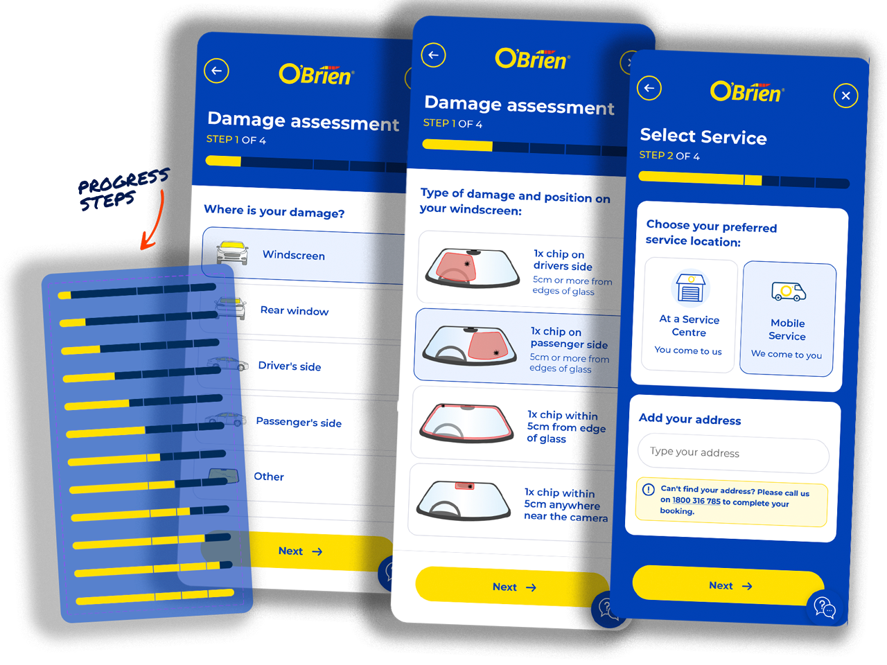
Progress & Help
Because the existing booking journey had to retain its structure, the new progress bar gives users a clear sense of where they are and how much is left, reducing uncertainty, while the persistent help bubble keeps support within easy reach if they get stuck. Together, they make the process feel more guided, transparent and manageable without changing the underlying booking flow.
-
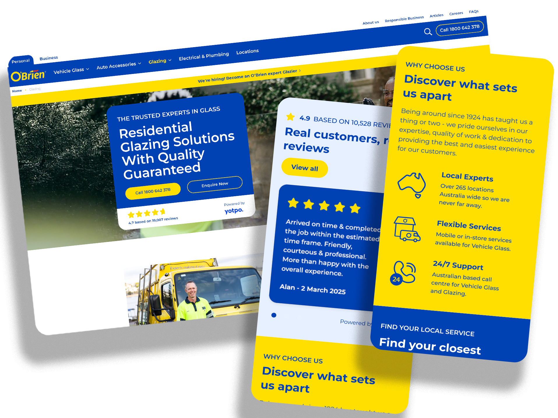
Confidence before the click
Customer reviews sit alongside practical service benefits and clear reasons to choose O’Brien. These modules give people reassurance while they compare their options, supporting a more informed decision before they enquire or book.
-
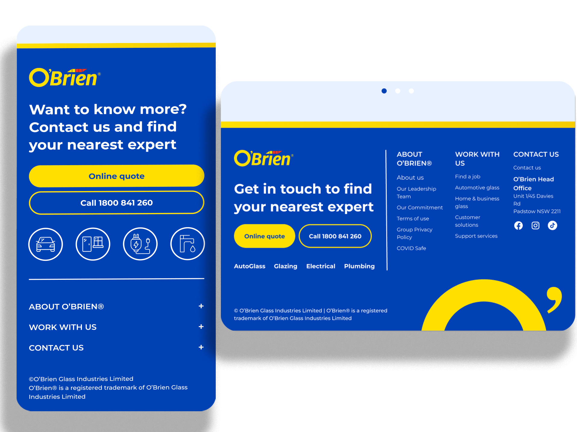
A more useful footer
The redesigned footer brings contact details, service links and company information into a clear hierarchy. Desktop and mobile layouts keep quote and call options prominent, giving customers a useful next step at the end of the page.
-
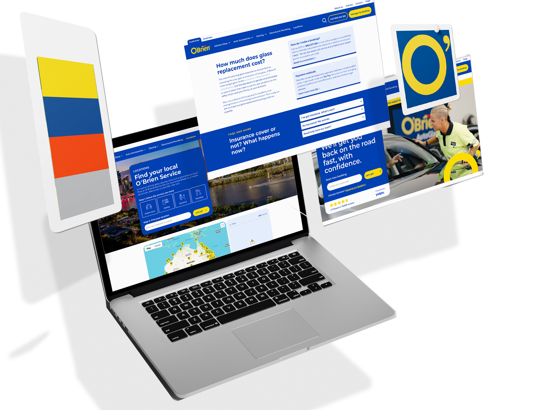
One brand, across every screen
O’Brien blue, yellow accents and consistent typography connect the refreshed modules. Colour gives key information and actions a clear visual order, while the imagery and graphic details carry the wider brand identity into the website.
-
Working with contraints
The design worked within the booking system’s existing requirements, including separate date and time screens. The optimisation work explored clearer benefit messaging and social proof to reduce hesitation; proposed test targets are not presented here as measured results.
-
Clearer pricing, next steps & confirmations
The final screens bring the appointment details, time off the road, service, price and discount into a clearer summary. Repair benefits and guarantee messaging provide useful reassurance before the payment step.